Contrast in Logo Design: Making Your Brand Stand Out
Introduction
In order to properly distinguish yourself from the often tough competition in today’s market, you need to have a clearly defined and memorable brand identity. A logo, which gives a visual identity to your company, is a fundamental element of a brand’s identity because it embodies the company’s offerings, character and values.
Creating or developing a professional logo involves many elements; However, one of the main elements of making a logo stand out is the use of contrast and, if used correctly, it can create sync with your logo and add memorability. Contrast is used to make opposing distinctions. So, by using contrasting elements, you can help create a remarkable and eye-catching logo.
This article will further explain the use of contrast in logo design in terms of the benefits of contrast as well as the importance of using contrast in logo design and how to use it correctly to develop a unique logo that captures attention and reminds viewers of their experience.
What is contrast in logo design?
Contrast in logo design involves using opposite characteristics in variables such as typography, size, shape, color, etc. When you can contrast one feature against another with visual elements, you have the opportunity to create a composition that is visually stimulating, visually integrating, and pleasing to the eye.
The designer can leverage contrast to differentiate different elements and control vision towards a focal point, thereby enhancing the perception of the logo, uniqueness or identity and associated brand message.
The importance of contrast in logo design
1. Visibility
It is increasingly difficult to attract the attention of the people you want to target. Contrast helps ensure people notice your brand in a busy environment. Different styles, bold shapes, and bright colors can all help make your logo more recognizable and visible.
2. Brand Personality
Colors shape perceptions and feelings, with contrast highlighting your brand values and personality. Softer colors are sophisticated and elegant, for example, while bright colors carry enthusiasm and energy.
3. Memorability
Contrast creates lasting impressions in the minds of your target audience. Logos designed this way make it easier to remember and strengthen the connections people have with your brand, regardless of how they interact and engage with it.
4. Differentiation
Differentiation is the key to success in highly competitive markets, and unique logos are a game-changer in this regard. Your logo will be memorable and successful because it strongly uses contrasting elements.
How to Achieve Contrast in Logo Design
1. Color
This is the most essential aspect of establishing contrast in your logo. Contrasting and complementary colors are essential to achieve this. Grouping cool and warm tones or other complementary colors can create an exciting and dynamic logo. Each color should be evaluated separately based on the emotion it conveys and then how it relates to your brand values.
2. Size/Shape
You can play with many different shapes and sizes to achieve a contrasting appeal. Using geometric and organic shapes will create both interest and differentiation. Using different sizes in your logo does two things: (1) adds layers/structure to the overall design and (2) creates an attractive visual hierarchy that you want.
3. Typography
The typography of a logo is an important element to use and a contrast in typography can add a nice touch to a logo. A bold font combined with a stylish font can create a visually compelling logo, and when combined with the right images, it can help express the character of the brand.
4. Negative space
Using negative space can take a logo design to a whole new level. Of course, negative space can also have to do with the spirit of a logo, but using negative space well in a logo can create an image that contains a hidden image or secondary image that people can get lost in to create deeper intrigue, depth, and overall design. This could create a mentally deeper and more memorable logo.
Brands that use contrast


1.Nike
The Nike logo or “swoosh” is actually a perfect example of contrast in logos. The bold curve of the swoosh, in contrast to the relatively simple text, is also quite dynamic while still being memorable. The firm contrast of the “swoosh” and the white (black and white) brings the logo together.
2. Cloud Beds
The CloudBeds logo is an absolute example of using contrast for maximum impact. The contrast between the calm, cool blue and energetic orange of the CloudBeds logo does more than grab the viewer’s attention; this establishes a sense of trust and innovation. By providing these two contrasting colors, it provides an effective balance for the viewer, which accompanies the iconic quality of the logo and differentiates it from the competition in the cloud-based hospitality software space.
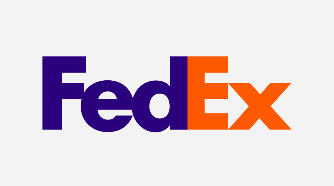
3. FedEx
FedEx is well known for its clever use of negative space in the original logo. They use negative space with the arrow between the “E” and the “X”, which evokes speed and movement. It’s a stunning contrast in a very simple design.
Takeaways
• Contrast can improve visibility, communicate your brand personality, improve memorability and create separation from the competition.
• Color, shape, size and typography are all ways to use contrast in your logos.
• Successful logos such as Nike, Coca-cola and FedEx all use contrast in their logos.
Best Tips
- Keep it simple: don’t complicate things for the sake of differentiation. Clutter leads to confusion, reducing the effectiveness of your message.
- Compatibility Testing: Make sure your logo looks good in all possible uses/circumstances, from the size of a business card, billboard to the social media accounts you manage.
- Know your audience: Use contrasts tailored to your target audience, consistent and appropriate with your brand identity. Colors have emotional feedback just like shapes, so it’s important to think about them in order to connect with customers who think individually.
How we can help you
We know that contrast is key to a logo. At GraphicSprings, we strive to help businesses create stunning and memorable logos and brand identities.
- Logo Templates: If you need a starting point or are just looking for something to spark your imagination, check out our fun and comprehensive overview of ideas on our logo ideas page. All of these templates can be modified and adapted to your brand’s needs.
- Custom Logo Design: If you want something completely unique that represents your brand authentically, let’s connect with one of our expert designers to make it happen. Learn more about our custom logo design feature and work with our experienced designer to create an awesome logo!
- Logo Maker: Our logo maker is an easy way for other non-designers to get a professional logo in just minutes. Experiment with these opposing colors, shapes, and fonts to start presenting a logo that realizes your brand’s vision.
Conclusion
In conclusion, contrast might be one of the most powerful principles of logo development in building your brand’s visual identity effectively and memorablely. By consciously combining color, shape, size and type, you can create a logo that effectively defines your brand and helps you stand out from your competitors! Whether you choose one of our logo templates, use our custom logo option, or employ our logo maker to create a logo, GraphicSprings will ensure that you have a memorable and distinctive logo that your brand deserves. We would love to be your creative partner to help ensure your brand stands out and has the opportunity to be remembered through the art of contrast in logo development!
Lukas is part of the GraphicSprings content writing team, bringing his marketing expertise to the forefront. A marketing graduate, he writes informative articles on social media, branding and logo design.
Graphic Design
Game Center
Pendidikan
Pendidikan
Download Anime
News Today