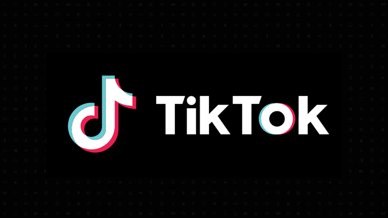
The evolution of the TikTok logo
When it comes to the internet, brand logos may matter more than anything else. Think about it! They’re on your business website, on your social media pages, in your emails, and just about anywhere you connect with your customers.
This is why social media platforms like TikTok must have distinct brand logos that users can easily identify in the highly competitive world of online marketing.
Below, we dive into the evolution of the TikTok logo. Our goal is to help you understand how TikTok came up with its logo so that you too can design a high-quality logo that is just as memorable for your audience.
TikTok and its brand story
TikTok was initially called Douyin and was launched in Chinese markets in 2016 by its parent company, ByteDance. Their original logo was a bit different than what we see today and reflected a simpler soundwave design, in line with the brand’s focus on short-form audio and video content.
Since 2018, however, the app has used a stylized black musical note featuring a blue and red shaded area on either side of the design. It’s still a simple design. But it’s a little more fun and colorful, which really reflects the fun and diverse content shared there.
Bringing TikTok into the future
The app was eventually rebranded as TikTok and launched in international markets where it found tons of people who just can’t get enough of the short video clips you can find on the platform.
Over the years, TikTok’s popularity has exploded.
And today it is practically impossible to find young people who do not have the application on their cell phone. The new logo, as mentioned, looks a little more fun and playful, showing how working with professional brand designers and a PR or reputation management company can have a huge positive impact when growing or rebranding a business.
For a tip
Always remember that the colors of a logo can have a huge influence on how people perceive your design. In this case, TikTok’s decision to include a pop of red and blue/green was a great way to showcase the brand as a fun and playful company.
The symbolism of the TikTok logo
Logos are not just images. These are symbols that represent a brand, its products or services and how they want their audience to perceive them. So, a good logo should be imbued with a little deeper symbolism or meaning to add a special touch to the design.
Let’s take a look at some of the symbolism behind the TikTok logo.
Creative expression
TikTok users are both video viewers and content creators. It is therefore clear that a good portion of TikTokers consider themselves to be creative people. Therefore, the image and choice of colors perfectly embody the creative spirit of its users.
Playful and fun
We’ve already talked about this one. But the colors used in the logo are simply fun and entertaining. They bring a touch of visual contrast that is pleasant to look at. And they’re perfect for symbolizing the light-hearted content you can find on TikTok.
Dynamism
The logo can also be a symbol of the fast and dynamic environment of short content. The blue and red outline also incorporates an element of movement which is the perfect symbol for a dynamic brand like this.
Keeping the TikTok logo in step with the times
As with almost all brands, it’s important to rethink your logo design from time to time.
The way TikTok changed its logo when it rebranded and launched in international markets shows you that branding always needs to be redesigned based on major changes in the business.
If Douyin had kept its original logo and not changed its name to TikTok, there’s a good chance it wouldn’t have become what it is today.
For a tip
Whether your brand has an upcoming corporate event or there is any other type of special occasion coming up, you should look for ways to even temporarily redesign your logo to create a little buzz around your brand.
What we learned from TikTok’s logo journey
Now, before you jump in with your own logo… Let’s first take a quick look at everything we learned from TikTok’s logo design journey.
- The playful side can be important – Not all brands should be considered fun or playful. But adopting a fun or light-hearted brand personality can be an incredibly effective choice, especially for brands working with younger audiences.
- Connect globally – Douyin’s rebranding is a great example of how brands shouldn’t limit themselves to local markets. By rebranding TikTok, they allowed themselves to access international markets and achieve unhindered growth.
- Adaptability is crucial – TikTok’s logo is simple but it can be used practically anywhere. From small icons to large billboards. It’s a simple, versatile design that’s exactly what you’re looking for in a good logo.
- Express your brand personality – TikTok didn’t just choose a symbol they liked. They chose a design that aligned with their brand, corporate culture and their target audience.
Create logos that reflect a generation
TikTok’s logo design journey will show you that logo design is not as simple as it seems. Yes, you can simply choose an icon, put your brand name on it and end this activity.
But effective branding goes much deeper than that. Good logos are not just visual designs. These are emblems that represent a company as a whole. And it can be just as important as anything a company does.
So if you’re looking to design a new logo, check out our custom logo services or use our logo maker today!

David Williams, a veteran content writer at GraphicSprings and marketing graduate, brings his expertise to bear on engaging articles on logo design, branding, and entrepreneurship. It is your go-to source for actionable information in these areas.
Graphic Design
Game Center
Pendidikan
Pendidikan
Download Anime
News Today

Related Posts
How to Format Photo ..

What You Must Know Before Running Ads